Royal Nuts
Royal Nuts
Royal Nuts
Package Design
Year
2022
Client
Royal Nuts
Class: Package Design
Co-Designer: Lucy Chen
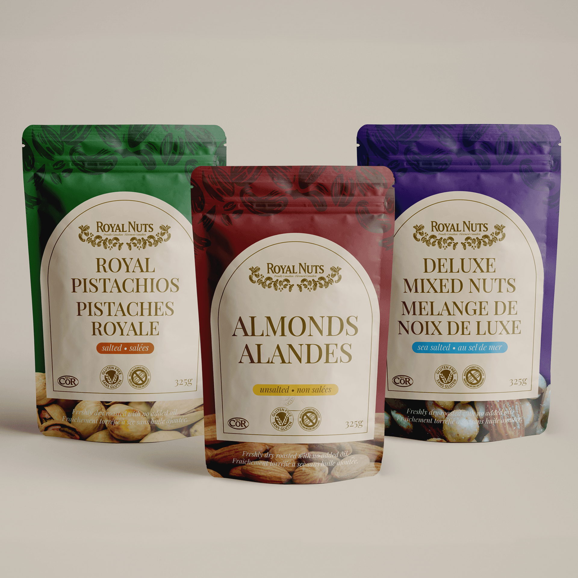
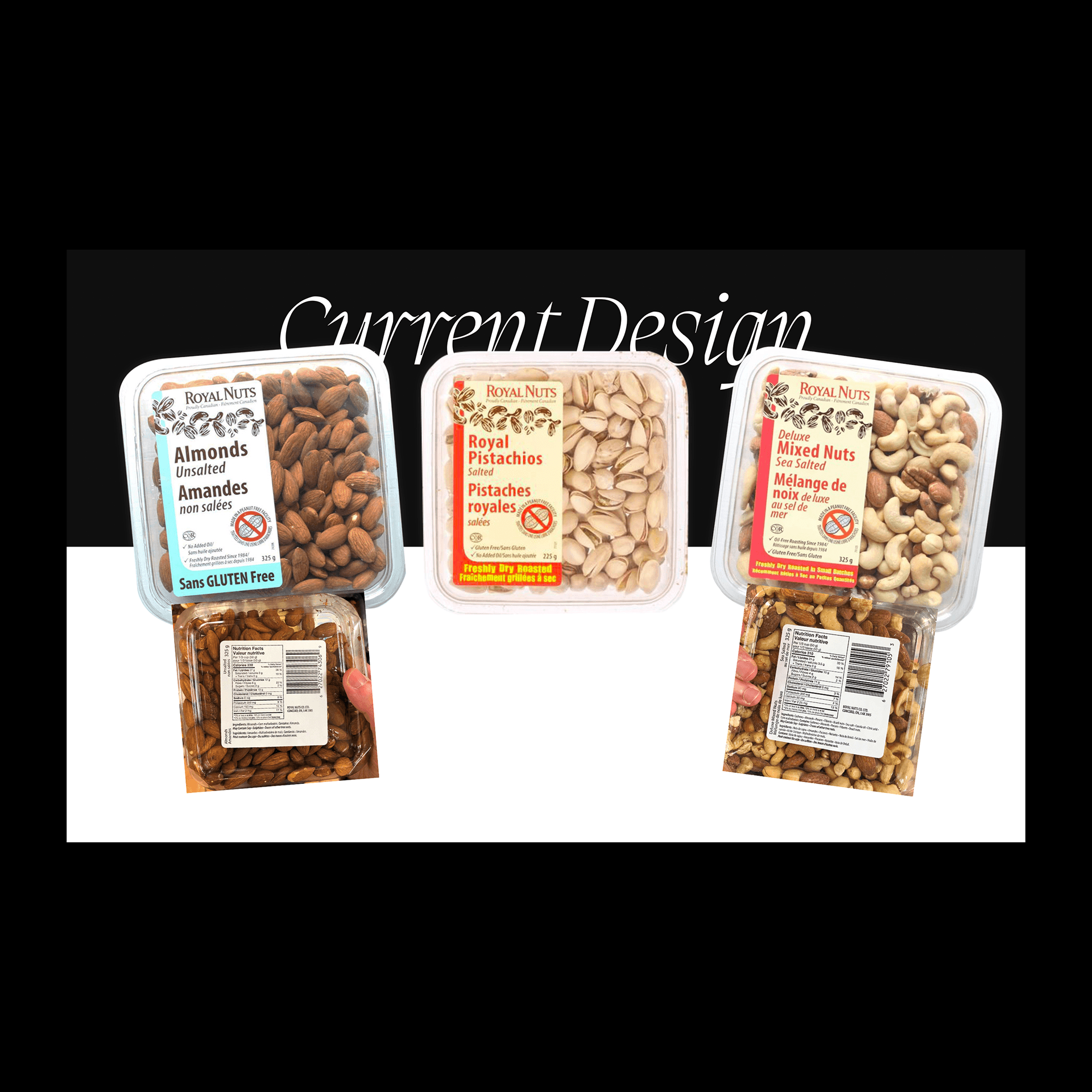
This assignment required a pair of designers to choose an existing product on grocery shelves that we felt was lacking and completely redesign the product package. The product that my partner and I chose was: Royal Nuts.
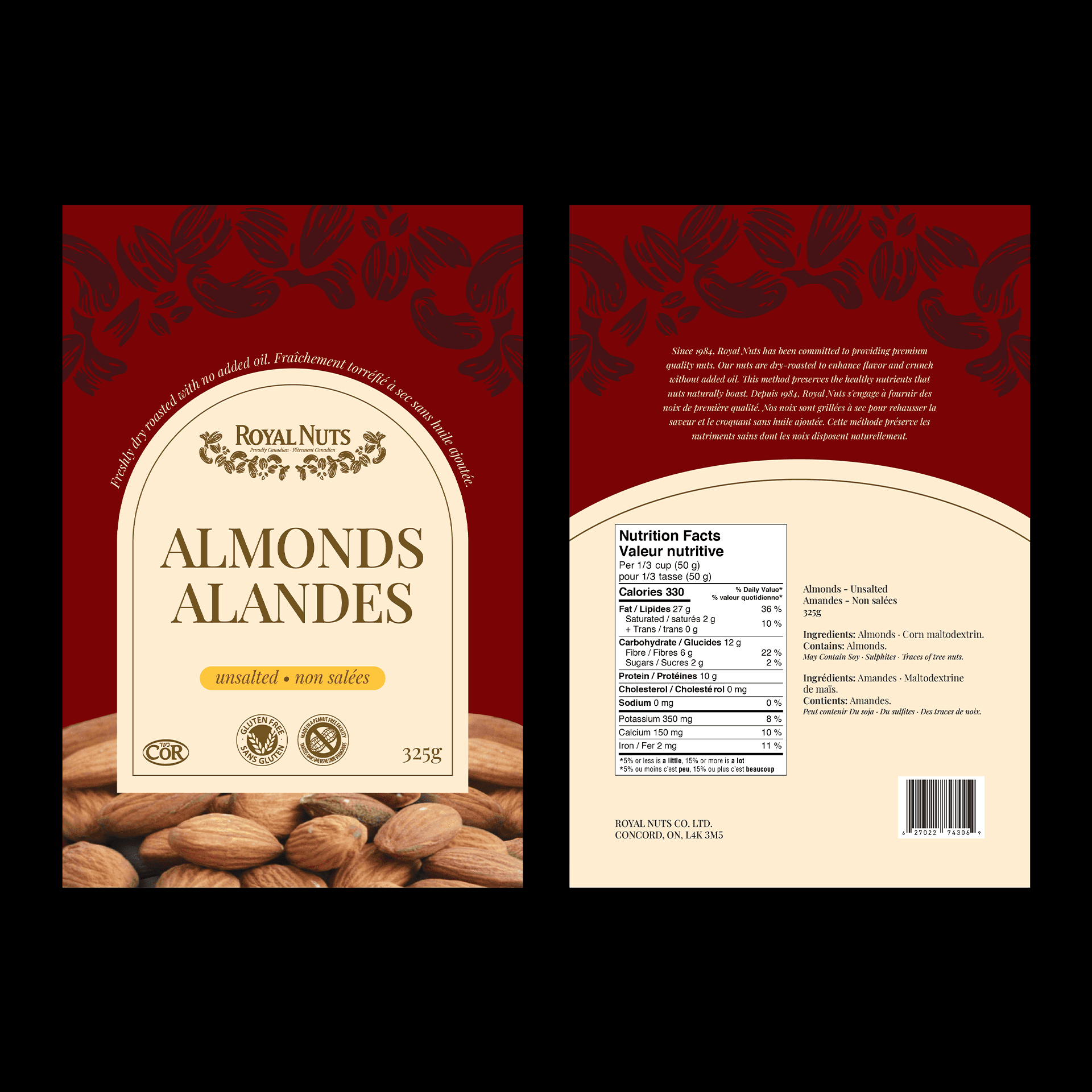
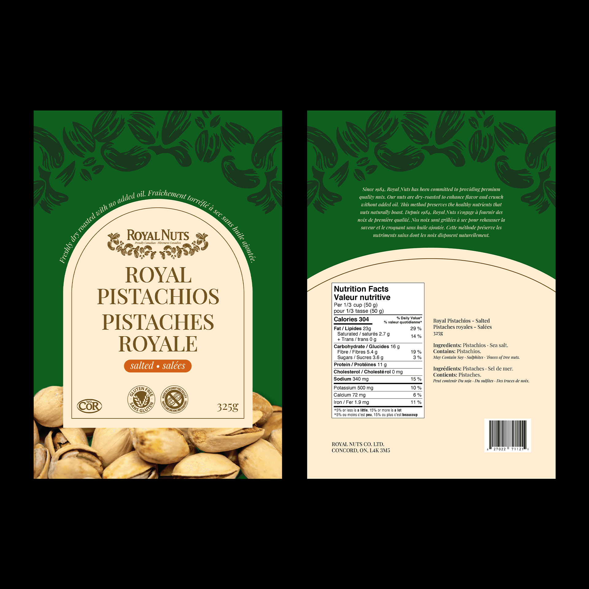
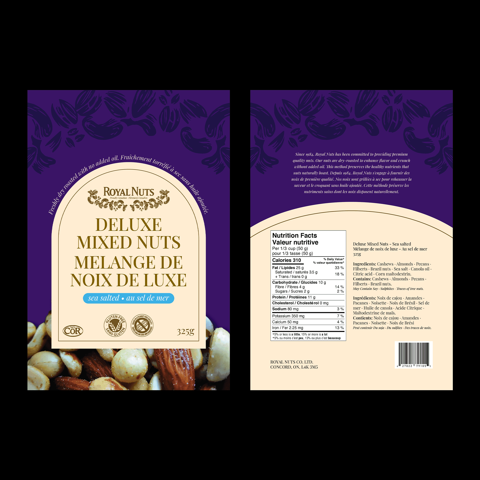
If there was one thing we wanted to preserve and highlight in our designs, it would be to create a brand identity fitting the brand name of “Royal Nuts” while trying to keep the appearance traditional, consistent, and competitive. This entailed choosing colours that were not too vibrant to stay true to the keyword of “Royal.” Since we opted to utilize a substrate that contained no plastic, we had to ensure that our designs evoked a feeling through appealing imagery and regal colours, rather than the conventional method of a transparent window that allowed the consumers to see the actual product inside.
One of the challenges we faced during the pre-production phase was finding a way to categorize the many varieties of flavours and mixes that Royal Nuts offered such as the type of nut, salted/unsalted/sea-salted, organics, etc. Our solution was to simplify the elements as much as we could and use only a two-colour combination to differentiate the nuts and flavours. We also tried to enforce a strong sense of hierarchy by reducing the amount of textual elements present in their original design.
However, we tried to refresh and reinvent existing brand elements to maintain any existing consumer markets that Royal Nuts has formed over their 30 years of business by choosing a similar typeface and redesigning their logo better to reflect the present and future market of healthy snacks.
